First Article type logo / insigina
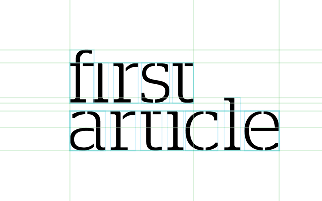
Under the font house moniker, Commercial Type, Berton Hasebe and Christian Schwartz collaborated on the design of Stag Stencil in 2008. Formula One magazine in Europe enjoyed Stag so much, they commissioned a stencil version. This was a relatively late edition to the already well established Stag font family in 2005. Though trailing its ancestors by three years, the addition was natural to the family. Stag Stencil takes the masculinity of the original slab serif and juxtaposes its characters by giving it a clean yet guerrilla marketing stencil-ready approach. Now that we have a bit of the history covered: the very font discussed above was used to create the First Article logo and insignia. The ligatures in the family are stellar and yielded exceptional results. The joy of this versatile font made it legible at any scale - paragraph reading as a serif and large scale reading as a slab stencil. Stag Stencil is a beautiful stand-alone font and the only augmentation needed for the typography logo was to remove the ascenders in the "t" and "i" to establish body relationship through a clean x-height. The tracking and kerning was visually natural, and something about lower case logos makes the brand earnest and humble.
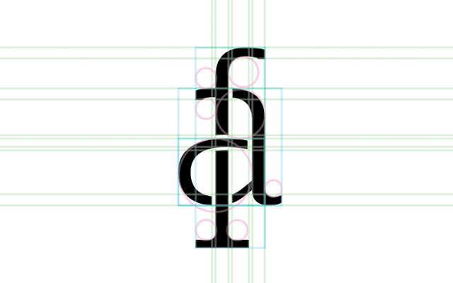
The First Article insignia came as an instinctual thought as the "f" with its long stem, and an "a" with its open counter, made a memorable and playful pairing. The f's shoulder is completed by the a's bowl as its stem naturally progresses south. The work these two letters put in, creates an everlasting but more importantly, a natural effect to the viewer. For those who know, let "the quick brown fox jumps over the lazy dog".

