JPMORGAN CHASE
Art Direction across mobile, web, and print channels
BRIEF
Given the opportunity, we would all agree that the sex appeal in finance is spending the money rather than managing it. We assisted JPMorgan Chase in putting a little bit of charm and strategy into money management while working on everything from large screen kiosk designs, to app icon refreshes, and mobile application concepts as part of a design incubator program.
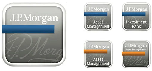
APP ICON REFRESH
The App Store carries more than 70,000 apps and has become quite crowded with many different financial management applications.
There are two high level ways to approach the consolidation order of these icons. Group the sets of icons through the hierarchy of the lines of business' using it’s established legacy colors and marks, or keep it as a uniformed icon system, all adhering to a similar aesthetic standard with a small embellishment such as a ribbon or flag as a differentiation between devices. Our assessment addressed future visual proposals.


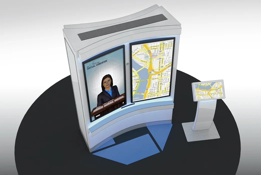
BIG SCREEN DESIGN


MOBILE DESIGN STRATEGY
